3 Reasons to NOT Use Photoshop For Your Graphics

3 Reasons to NOT Use Photoshop for Your Graphics
When people talk about pro design software, they usually think of either Photoshop of Illustrator. And many people use these programs for their projects, which of course is great if that’s what they’re the most comfortable with.

The type of software you use is a matter of personal preference and you should always go with what makes your work easiest for you.

However in my work, I have found that this is not always the best idea.

Now before I go any further let me say, I love Photoshop. It’s an indispensable tool for me and I could not work without it.

So first of all let me say what it IS good for…

Photoshop is great for what it was designed for and that is PHOTOS.

Photoshop is best for editing your images. It is needful for resizing images, editing images and making them look the way you need them to for your layout. This is what Photoshop was designed for, and so this is what it’s going to do well.

And while Photoshop does have some layout features like formatting text and creating other design elements like lines or boxes, layout is not its main purpose, and these features are generally clunky and difficult to use. Any time in the past that I ever tried to create any type of layout with text and artwork in Photoshop, it’s just been a frustrating experience.

So while some people do all their graphics in Photoshop, and some only do web projects like social media graphics, I do none that involve text or other artwork elements on top of an image.

Here are 3 reasons why I keep Photoshop for working on my photos and NOT for my layouts:

1. Layers are an unnecessary pain for layout.

Photoshop files work based on layers, and quite simply, layers are a pain for layout.

Every different element in a Photoshop document is on a different layer. Your background image is on a layer. Then each individual text block you have is on its own different and separate layer. Any other design elements like boxes or lines will each have their own layer. Layers upon layers.

And to make any changes on any of these layers, you have to make sure the correct layer is selected to do what you need. I cannot tell you the times I’ve meant to move this one thing and ended up moving or changing something else because I did not have the right layer selected.

This is really annoying to work with and takes extra time and frustration.

And making sure you’re clicking on the right layer all the time to do what you need to a certain element is tricky. It takes extra thought. Who needs that?

Again just unnecessary, and trust me there are easier ways to do this.

2. You really have to pay attention to your image size and resolution (DPI) in Photoshop.

Graphics created in Photoshop are completely resolution based – images, text and all. And what this means is that you can only size your finished graphic to whatever resolution you have it set at in the Photoshop document. You can make your finished graphic the same size or smaller as your document, but you can’t make it larger without losing quality and making your graphic blurry.

Whereas when you make them in InDesign or Illustrator, only the images you place in the documents are resolution based. These programs are vector based, which means text and graphics (other than images) have a hard line and can be enlarged to any size. They are not based on resolution. Graphics can be made larger without losing quality.

This is not AS big of a deal for graphics you make for the web like social media images or blog graphics, but it is still something you have to think about.

And I would really advise against using Photoshop for anything for print. This would include projects like pdf downloads, or things like postcards, business cards or brochures. I’ve worked in a print shop before and have seen people try it enough to know, your text will print fuzzy and overall your graphics will not be crisp and clean like they could be.

3. It’s difficult to resize whole layouts or reuse parts of layouts done in Photoshop.

Something that is really going to save you time with your blog graphics is using templates or using parts of one graphic to make another.

This is really not the easiest thing to do in Photoshop. Neither is resizing artwork. With all the layers, it’s just an awkward process that’s not that easy to do and really takes time and thought.

Since it’s primarily an image platform, Photoshop does not do a great job with easily resizing all the elements in a layout. And copying and pasting elements from one graphic to make another is also awkward and difficult.

InDesign or Illustrator make it much quicker and easier to repurpose whole designs or parts of designs to quickly create new graphics.

So then what about Illustrator?

Illustrator is better as far as not being resolution based, and thankfully you don’t have to use layers, and this can be a matter of preference but for me personally, it’s still not the best layout program.

Like Photoshop is geared for photos, Illustrator is geared for illustrations, and like Photoshop, the tools in Illustrator are more geared for this. It does not have the layout tools and working with images is not as easy either.

I’ve found that it has it’s own ways that it’s not as good to use for layout. Again, many people use Illustrator and that’s great, and different people are comfortable with different things.

But in my experience, Illustrator is great for creating illustrations, another form of artwork. And the thing with this is that because it’s made for illustrations, that’s what all the tools and menus are geared for.

Why I use InDesign for all my graphics instead.

So the way Photoshop and Illustrator are both designed to be for photos and illustrations respectively, InDesign is designed to be a layout tool. And because of this, its features are specifically geared to make things you need for layout faster and easier. It does all of this really well, and having all my blog graphics, social media images, pdf downloads and other projects in InDesign makes it easy to copy and paste things between documents.

Photoshop and Illustrator both are indispensable. I use them frequently for what they were designed for. I use Photoshop to resize and edit my images, and I use Illustrator when I need a logo or other custom artwork.

But when I want to bring it all together in a layout, I use InDesign, because that’s what it does best. I can do all my print projects, pdf downloads and social media and blog graphics easily in InDesign, and can export them straight into the format that I need to upload to my site or to print.

Wrapping Up

The software you use is a personal decision and in the end you have to decide what you’re comfortable with. Wether you decide to use pro software or more simple online tools like Canva. This is all my opinion and what I’ve found to be true in my own work. Many designers and others have their own opinions of what they think is the best and that’s fine. This can be a pretty hotly debated topic.

Again, use what you’re comfortable with. I just make suggestions 🙂 Try out different things and do what’s best for you to make your life easier.

Get my FREE InDesign Mini Course

Get access to my 5-lesson video course to learn how to create blog graphics, checklists, worksheets, promo graphics and more.
The Non Designer’s Guide To Choosing Basic Fonts

The Non-Designer’s Guide To Choosing Basic Fonts

Note: This post contains affiliate links, which are noted with an asterisk (*).

This is part 2 of my series “How to Create a Design Style.” You can find the other posts in the series at these links:

Choosing your fonts can definitely be overwhelming — with so many styles to choose from it’s hard to know where to begin. The thing to know though is that there are some things you can do that can help make finding good fonts a lot easier than you would think.

First, I would highly suggest answering the questions in this post about your business, in terms of the message you’re trying to send and the mood you’re trying to create. Thinking about the answers to these can really help narrow things down for you and help you find your fonts a lot faster.

Then, keep reading for some things to keep in mind while you’re looking. It basically just boils down to knowing the types of fonts you need, and some good places to find them.

1. You’ll need to know a few font terms.

When you look for fonts, you’ll notice that there are of course many different kinds, but the thing to know is that they can be broken down into a handful of categories. And while there are many types, these are the basic ones. Just knowing these covers most of the bases.

Here are the basic types of fonts:  Serif, Sans Serif, Script and Slab Serif.

Serif Fonts – Serif fonts are generally for more traditional or elegant styles. They get this name from the tiny decorative flourishes on each of the letters called “serifs”. Serif fonts are great for headers, and when used properly can work well for body text. Here’s an example of a Serif font:

Serif fonts can give a classy look to headlines.

Sans Serif Fonts – Sans serif fonts create a more modern or contemporary look. They have a very clean feel since they don’t have the serifs, hence the “sans” in the name. These can be used for any type of text or content, and work great for either headers or body text. Here’s an example of a Sans Serif font:

Sans Serif fonts are easiest to read.

Script (or Handwritten) Fonts – Script fonts give an elegant, artsy look and should be used very sparingly. You also want to use these at a larger size so they’re not hard to read. They should only be used for headers and other short phrases. Here is an example:

Script fonts can be hard to read at smaller sizes.

Slab Serif Fonts – Slab serif fonts generally give a more laid back and informal look. Their serifs are more “block” like and squared off. These are best used in headers as a more decorative font. I would stay away from using slab serif fonts in body text since they can be hard to read in paragraph form at smaller sizes. Here is an example:

Slab Serif fonts can work great in headers.

When you are trying to decide which of these types to use for your style, you’ll definitely want to choose fonts that fit with the message you’re trying to send to your audience, and the mood you’re trying to create.

2. You mainly need 2 fonts for your design style.

To start out with, you really only need 2 fonts. You will need a Display font a for headlines and subheads, and a second font for Body Text. That’s really all you need to begin with. I’ve also listed some optional extra types that can dress things up a bit.

But you do really only need these 2 to start.

First – Display font for headings, titles and subheadings

Display Fonts – Display fonts are generally more bold and can be more decorative since they are used at larger sizes for headlines or other attention-grabbing copy.

This is an example of a Display font.

Your display font is definitely the most important. This is the one that is going to give the most personality to the look of your style, and I would put the most time into finding the right font.

I would suggest sticking with serif, sans serif or slab serif for this, since script fonts can be a little more tricky as far as readability.

When you’re just starting out, definitely keep this font simple. Simple does not have to mean boring — it can also mean clean and classy.

Google fonts has a ton of great free options. Here are some ideas:

Second – Body text font

Body Text Fonts – Body text fonts are generally more plain and simple, and work well at a smaller size since they’re easier to read and are used for paragraphs of text.

This is an example of a Body Text font.

It’s a good idea to choose a font with different styles like bold, semi bold, italic, bold italic, etc. That way when you emphasize something in your content, you automatically have a matching font to do it with.

Serif or sans serif fonts work great for this, but be careful with using serif fonts for body text because they can tend to be hard to read at the smaller size. Using a clean sans serif font is usually the safest option for readability.

Again, Google Fonts is a great place to find a ton of these, and these are some good options:

A Couple Tips on Font Combining and “Test Driving” Fonts:

Font Combining – Google Fonts has a neat feature where you can click on a font and it will show you some great fonts that will go with it. Just go to the “Pairings” tab under each font.

Font “Test Driving” – Most sites will have a place where you can type in some text to “test drive” the font. Try this with several words to make sure it’s going to look like you think. The preview images for these only show these fonts in their best light, and I’ve found that sometimes a font I thought I would like doesn’t work as well when I try out different words.

Other optional types of fonts:

These last 2 are definitely optional, but when used right they can do a lot dress up your look:

Decorative Fonts – These types of fonts are only used sparingly, but when done right they can really add some interest to your style. Script or handwritten fonts also work well for this.

I’ve found that the best fonts for this are usually paid versions, and you can find some great ones at Creative Market*. (Note: People also refer to these as “display” fonts, so the term can be used interchangeably. A display font is essentially any font that can be used as a header, and this can include many types of fonts from the most simple and plain to the most ornate.)

Again think readability here, especially with these. On the really decorative ones, I only ever use the font in a large header, on 1 to 3 words at a time. Never a whole phrase and never a whole sentence.

I also make sure to use these at a fairly decent size. You really do not want to use fonts like this at a small size and risk your text being hard to read.

Think of these fonts as “the cherry on top.” Again, you use them very sparingly, so as to not let them overpower your layout. It doesn’t take much for them to have a good effect.

Pull Quote Text – Also sometimes referred to as “call out text.” This is text that is used to call attention to a certain quote either from your body text or to reference a quote from someone else.

This is an example style for a pull quote, also referred to as 'call out text'."

It’s usually larger in size than the rest, and is sometimes a different color. Many times an italic version of a font is used. I suggest using an italic version of your body text for this so it will blend well with your body text font.

3. Where to find fonts.

While there are definitely many places to find fonts, here are some of my favorites:

Creative Market* – One of the best places to find beautiful script or handwritten fonts, display fonts, logo fonts, plus tons of other great artwork.

Google Fonts – Great commercial use fonts you can use for free, plus I love their feature that makes it easy to find those elusive font combinations.

Font Squirrel – This is a great place to find free commercial use fonts.

Dafont.com – Each font should list the type of use it’s okay for. Make sure it does not say “personal use.”

Quick Tip: I don’t download fonts from just anywhere, because some font sites can be spammy. Plus their fonts may only be licensed for personal use. I try to stick with a few very reputable font sites to avoid accidentally downloading a virus, plus if you’re using them for your monetized blog, you’ll definitely want to only use fonts that are licensed for commercial use.

Wrapping Up

Finding fonts for your style does not have to be as difficult as it sounds.

Again, you only need a couple types of fonts for your style, and it’s definitely best to keep it simple, especially when you’re just starting out. You don’t want it to be too boring, but clean and classic is always a safe bet. Use your instincts, and you don’t have to be a pro to get this right. Just use what looks good to you. Besides, you can always change it later if you need to.

Ask yourself, do these fonts fit with the style and image I’m trying to present? Do they make my business look professional? Are they clean and easy to read? If you can answer yes to those questions, you’re well on your way to a great style.

Any questions about fonts? I’d love to hear them in the comments!

Get my FREE InDesign Mini Course

Get access to my 5-lesson video course to learn how to create blog graphics, checklists, worksheets, promo graphics and more.
The Non-Designer’s Guide to Choosing Colors

The Non-Designer's Guide to Choosing Basic Colors

This is part 3 of my series “How to Create a Design Style.” You can find the other posts in the series at these links:

After choosing your fonts, your colors are the next most important element to your design style.

And while there is a dizzying assortment of color options and palettes out there, this can actually be a fairly simple process.

The key is to know what colors to look for, how to understand color palettes, and then how to use the colors once you find the palette that works for you.

And the other key principle here is to keep it simple. Less is more definitely applies here — you don’t want to go overboard with your color.

When color is done right and used in a simple fashion, it can really make your graphics pop and give your business a classy, professional image.

Here are some things to keep in mind when choosing and using your colors:

1. Get clear on the mood you want to convey for your style.

Colors evoke feeling. Some colors give a sense of calm, while others give a sense of energy and action.

The colors you choose are going to create a certain mood and give your audience a certain feeling, so you definitely want to think through what that needs to look like for your style.

If you need help with this, I have some questions that you can answer here in this post that can get you started.

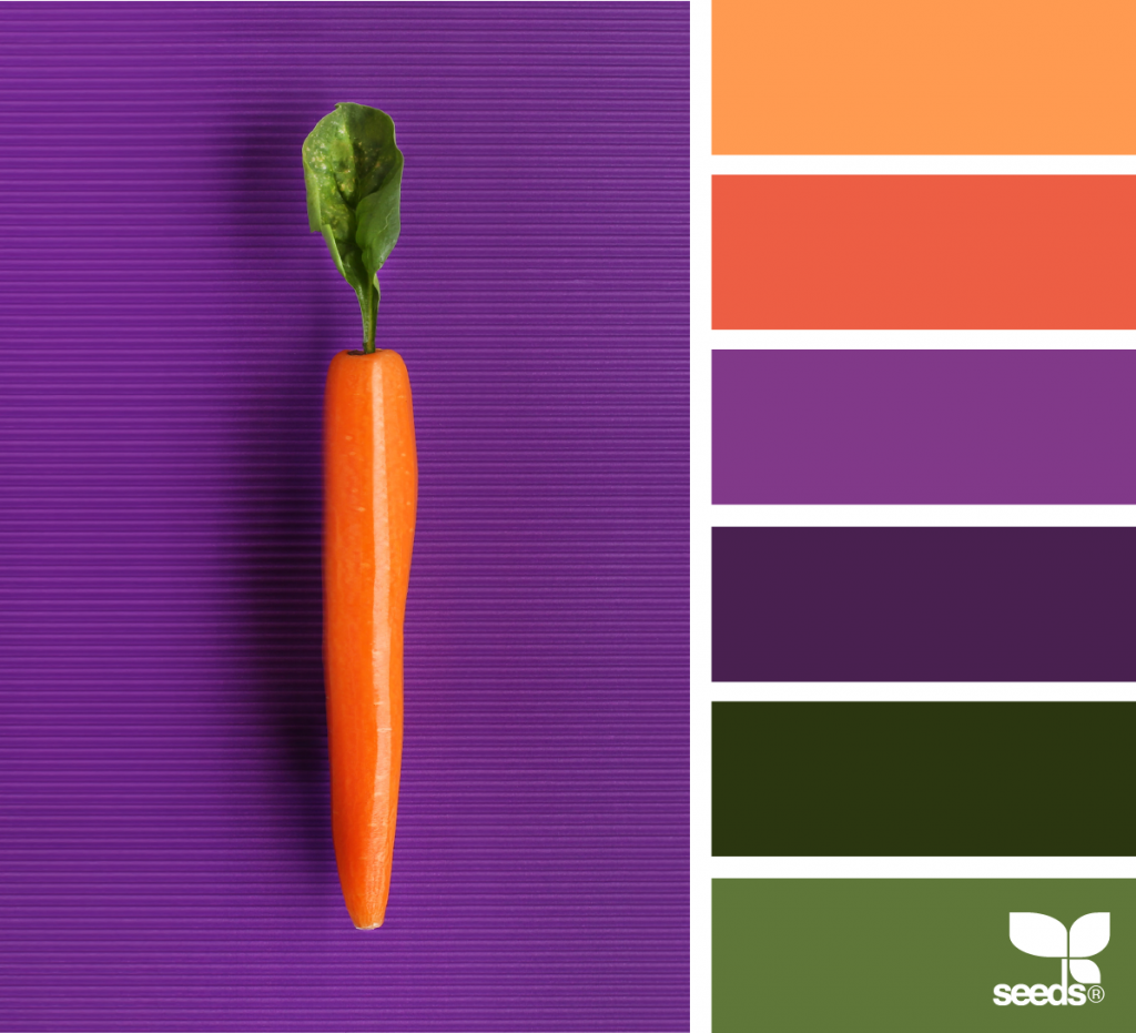
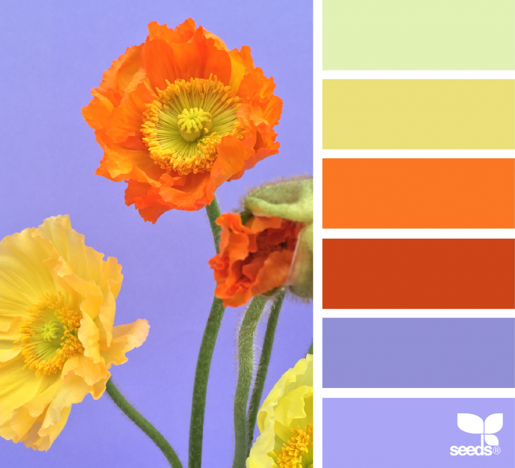
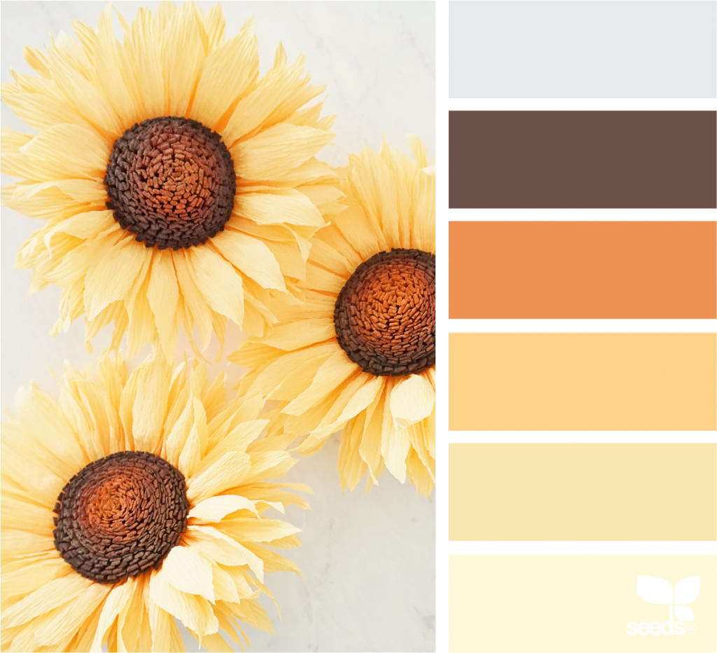
Brighter tones are more energizing and really pop. Muted tones tend to look more traditional and, depending on the shade, can give a more calming effect.

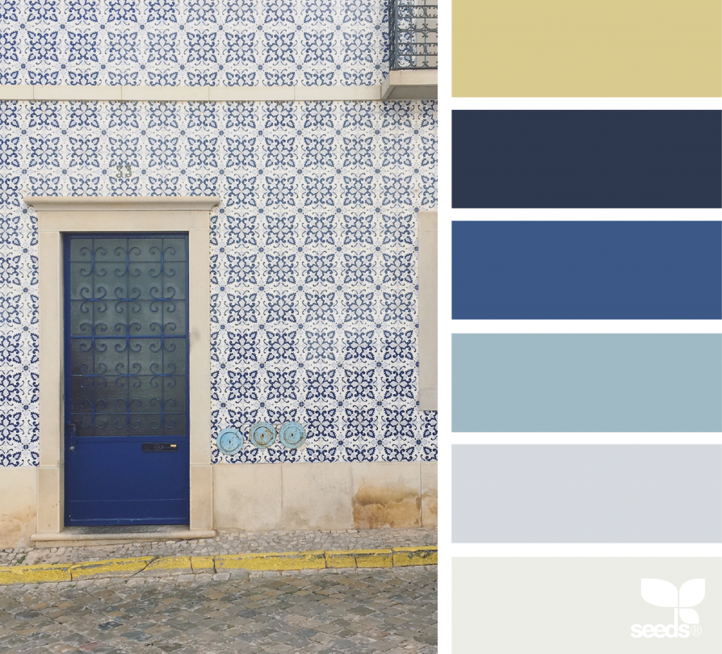
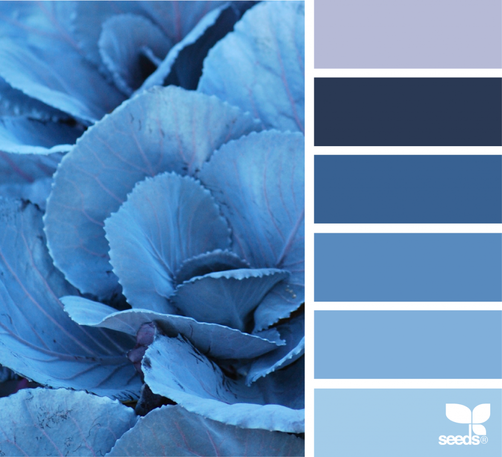
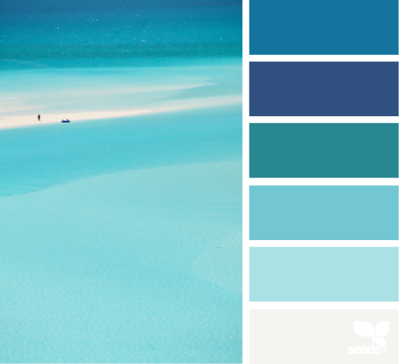
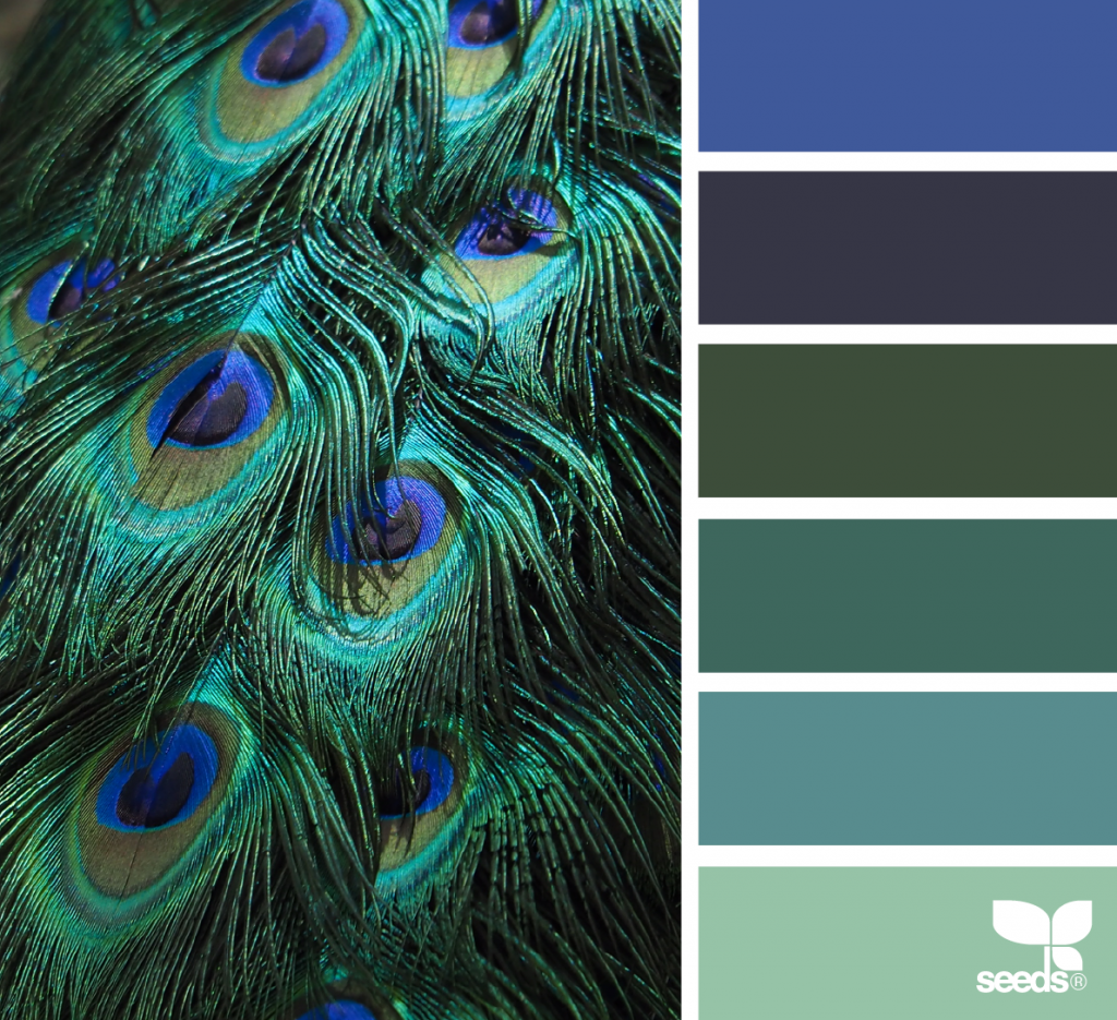
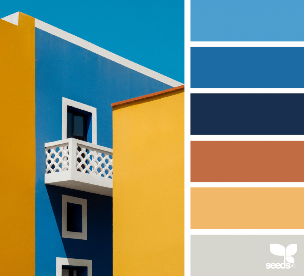
Here are some examples from Design Seeds:

Photo credit: @troy.archer

Photo credit: @theflowerjam

Photo credit: @elizabethmarkham

Photo credit: @622flowers

2. Learn how to "read" color palettes.

Color palettes can definitely be a bit confusing. But the trick is to know how to apply and use each color in the palette.

A great place for color inspiration, Design Seeds, usually has 5 or 6 colors to their palettes.

I’ll talk about this more below, but the key is to first decide on a main color that you want to go with. This will need to be a color that contrasts well with white, and then do a search for that color.

When you find palettes using your main color that fit the mood you’re trying to create, there should of course then be a swatch that represents your main color, and then other contrasting, or “accent”, colors around it.

Just choose the best 1 or 2 accent colors that are not too light, that contrast with or compliment your main color well, and will be visible enough on things like headers and backgrounds.

Then the other colors in the palette are usually on the lighter side, or are other variants on the main color or accents. Don’t feel like you have to use all of them, and in fact, you will want
to use any color other than your main color very sparingly. It can be easy to overdo it if you’re not careful.

These can work well for design elements like lines, boxes and backgrounds. The lighter shades can work well with darker text on top, and the darker shades work for using white text on top.

And the extra light shades can work really well for a light colored background option on a sales page or brochure.

3. Choose your main color first.

When you’re looking for colors for your style, you’re going to need to choose the one main color that you are going to use most prominently first. Then you can use that color to choose the others that will blend well with it, again, based on the mood and feeling you’re trying to create.

When you’re choosing your main color, definitely make sure it contrasts well with white. Don’t choose a color that is too light, or it will make any text that it’s used on unreadable.

You want to make sure the color is dark enough so that your headlines will be easy to read when the color is applied to them.

Stay away from lighter yellows, greens or other more pale shades as your main color.

4. Choose your accent color(s).

Accent colors are great to have and give more dimension to your designs. To choose accent colors, use your main color as a starting point and then choose colors that work well with that.

You will want to choose 1 or 2 accents at the most, and these colors will definitely affect the mood that your designs convey.

You can go 2 different ways with your accent colors. You can either choose a bright “complimentary” color — essentially the polar opposite of your main color, which generally creates a more vibrant look. Or you can choose colors that are closer in value to your main color, which gives a look that is more subdued.

For example:

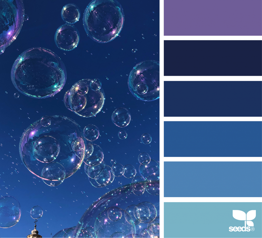
Let’s assume you choose a dark blue for your main color. You could go the more vibrant route and choose oranges, golds or yellows for your accent, or you could go for a more calming look and use greens or purples. Or to make it really simple, you can just use different shades of the same blue.

Here are some examples of this from Design Seeds

Photo credit: @andrea_sopranzi

Photo credit: @chrismoon1969


Photo credit: @greenineverycolor


Photo credit: @emilycontephotography


Photo credit: @thebungalow22


Photo credit: @marjamatkalla

5. Use your color sparingly.

As I’ve mentioned, you definitely want to try to not go overboard using your color.

Just sprinkle it through enough and it will make your designs pop in a classy way.

You will want to use your main color most of the time on your headlines and subheads, and then let the bulk of your text and your content be a black or gray color. You can also use shades of gray to add interest to certain types of elements as well.

When you do use your accent color(s), us them very sparingly for things like buttons or links, and use the extra colors in the color palettes when needed on other design elements like lines, boxes and backgrounds.

6. Look for color inspiration.

While there are definitely many tools out there for finding color ideas, my personal favorite place for color palette inspiration is Design Seeds, as you can tell from this post.

I love the way they choose color palettes from life.

They take photos of real life places, objects and scenery, and draw color palettes from the colors in the photo. To me this is really helpful for finding colors that are harmonious, soothing and that make sense together and work together well. It always makes for very natural combinations.

In Conclusion

While choosing your colors will take a little time, they can actually be fairly simple to find with a little know-how. Just choose the main color that represents the mood you’re trying to create, then use that as a springboard to find palettes with accents to really flesh it out.

And again, always remember with using your color — less is definitely more.

Any questions about choosing colors? I’d love to hear them in the comments!

Get my FREE InDesign Mini Course

Get access to my 5-lesson video course to learn how to create blog graphics, checklists, worksheets, promo graphics and more.
How to Make a Simple Text-Only Logo with InDesign

How to Make a Simple Text-Only Logo with InDesign (Plus Font Tips)

Play Video

This is part 4 of my series “How to Create a Design Style.” You can find the other posts in the series at these links:

Making your own logo does not have to be an intimidating prospect. In fact, an easy and inexpensive way for non-designers to create their own is to make a simple text-only logo.

Text-only logos are great because they’re easy to create, they look professional, and they make it really easy to follow the rules of good logo design. Plus If you think about it, some of the biggest and most well known brands use a text-only logo. Think Sony, FedEx, The New York Times, Google, and many more. Same thing with some popular bloggers like Amy Porterfield and Melyssa Griffin.

In this video, I’ll show you how I made my text-only logo in InDesign, plus how to export your logo from InDesign into different file formats that you can use for different things like web pages, social media graphics, presentations or print projects. And I’ve got some tips for choosing a good logo font, some suggestions for free fonts, plus more to help you get started:

Tips for choosing a good logo font:

Free logo font suggestions:

Tips for using color in your logo:

File types and terms mentioned in the video:

In the video I showed how you can export your logo from InDesign into these file types, and also discussed “vector graphics.” These are some file types that can get you started if all you have is InDesign, and I’ve included the terms here again for reference:

PDF – These can be placed in printable downloads, blog graphics, web pages or presentations, and can also be used in projects that will be professionally printed. In the video, the PDF logo graphic I made was a “vector” graphic because my text artwork in the file I used to make the PDF was vector-based (see below for an explanation of vector graphics).

JPEG – These files can be used on websites, social media graphics, slide presentations, e-books, or anything that will be viewed online. They are resolution-based so they can only be enlarged to a certain size before they start to become pixelated. It’s also best not to use a JPEG version of your logo for anything that will be printed because JPEG logos tend to print “fuzzy.”

PNG – These files have a transparent background and can be placed on web pages, social media graphics, slide presentations, e-books, or other screen-based projects. These are great for if the design has some color in the background, where you need your logo to not have a white box around it like with a JPEG. These are also resolution-based, and can only be enlarged so much. It’s best not to use these logo files on printed projects as well.

Vector Graphic – These are graphics that have clean and crisp lines, and can be enlarged to any size without losing quality. You will want to use a vector graphic of your logo for print projects like business cards or brochures, because these types of logos look clean on the final printed piece. If you’re using InDesign for your social media graphics or web graphics, you can go ahead and use vector versions of your logo on these as well because it will be converted to the right format along with the entire graphic when you export.

In Conclusion

Creating a professional logo does not have to be hard or complicated. A text-only logo is definitely a great way to get started, and later on you can always add to it or make another one if you decide you’d like something that’s a little more creative. There are lots of great resources out there when you’re ready.

Any questions about text-only logos? I’d love to hear them in the comments!

Get my FREE InDesign Mini Course

Get access to my 5-lesson video course to learn how to create blog graphics, checklists, worksheets, promo graphics and more.
5 Ways Being Your Own Designer is Not as Hard as it Sounds

5 Ways Being Your Own Design is Not as Hard as it Sounds

The thought of designing your own graphics can be pretty intimidating when you have no idea how to do it or where to start looking to figure it out. You know it’s something that needs to be done, you just aren’t sure how to make sense of everything you need to get started.

The thing to know is that it’s really not as scary or hard as it sounds.

In this post I’m going to share with you several things about designing for yourself that can help lower the intimidation factor and give you the confidence you need to get going.

1. You don’t need to know everything about design.

Pro designers have to know a lot about design because they’re doing all kinds of different designs with completely different styles, for lots of different clients. You’re only creating for yourself. You don’t need to know everything that the pros know about design to create good looking graphics.

Your design needs are really very simple. You’re not trying to win any contests or blow anyone away with your great design skill.

All you are needing to do is to get a message across to your audience, and look professional in the process.

You only need to understand basic design rules to make your designs look professional, and this is something that most anyone can do.

Just get the basics down, and many times that’s most of what you need to get everything done that you need to.

2. You can make great designs by just keeping it simple.

Here is the great thing about design. Less is more. Understated is best. And when you’re designing for yourself, this great because keeping it simple is very easy for you to do.

You don’t have to go crazy with artwork or bright and bold content to feel like you’re designing well. It’s actually better if you don’t.

Sometimes people will try to do too much or overwork the design, and the message ends up getting lost. A simple design that communicates well is much better than a flashy one that takes the attention from what you’re trying to say.

Keep it simple. Don’t worry about making these awesome, gorgeous designs. Some of the best designs I’ve seen have been the most understated, with a classy font and just some very simple content.

Keeping it simple also makes you look more professional. Just keep your designs clean and uncluttered and apply basic design rules. Your message will get across and your graphics will look great.

3. You don’t have to sweat it too much.

Here’s another great thing about designing for yourself. Your designs really do not have to be perfect.

Again like I mentioned, don’t feel like you have to create design awesomeness to be good at this. You’re not trying to win any contests.

Your goal is to communicate well and look professional, and most times a clean and classic look will do the trick.

Just start out with a simple design style with some classic fonts and a nice accent color, and then be conservative with your layout and clear with your content. Learn some basics with design and with your software, and you are most of the way there.

4. Designing for yourself gets easier with practice.

Like anything else, it may feel awkward at first but the more you practice at it the easier making your own graphics will get. Learning what you need to will take some work up front, and at first it may feel a little difficult to remember what to do.

But with time and a little practice, you will definitely get more comfortable with things and again, since you’re only doing this for yourself, everything will be much simpler for you than it would be for someone who does design for a living.

You will get better and become more comfortable, and eventually what you’re learning will click and won’t seem so difficult.

Designing for yourself is really not that hard once you know what to do. Don’t worry if you think you’re not getting it at first, you will get better over time.

5. Put in some work up front, and you’ll have a good setup to get your graphics done quickly and easily.

If you put in some work up front doing the things I’ve mentioned – learning the basics with design and software, take some time getting a simple design style down – and then setting up some templates for the types of graphics you use, it should make designing for yourself a much simpler thing that doesn’t have to be hard or take up so much of your time.

You want to get to the business of working on your own business and creating your own content. You don’t want to spend all day figuring out your graphics and want to get this part done as quickly as possible.

The good news is you can.

Again, if you keep it simple, practice and just stick to the basics, creating your own graphics doesn’t have to be difficult. Over time you’ll be a pro at getting the design part done so you can focus on the rest of your business.

Get my FREE InDesign Mini Course

Get access to my 5-lesson video course to learn how to create blog graphics, checklists, worksheets, promo graphics and more.
About the Author

Hi! I’m Melodie, and I help bloggers and solopreneurs create their own graphics for their businesses. I’ve been a graphic designer for over 20 years, and I can tell you that just by learning some basics, you can definitely create a professional look for your brand, even if you don’t see yourself as a designer.

How to Make an Image Fade to White with InDesign

How to Make an Image Fade to White with InDesign

Fading an image to white in InDesign is a really neat effect that can add interest to any graphic, and it’s quick and easy to do in InDesign with a simple tool. I’ll show you how in this tutorial.

Get my FREE InDesign Mini Course

Get access to my 5-lesson video course to learn how to create blog graphics, checklists, worksheets, promo graphics and more.

How to Make an Image Fade to White with InDesign

If you enjoyed this video, would you consider a repin? Thanks!

9 Behind-the-Scenes Questions to Help You Get More Confidence with Your Designs

9 Behind-the-Scenes Questions to Help You Get More Confidence with Your Designs

9 Behind-the-Scenes Questions to Help You Get More Confidence with Your Designs

When you’re designing for yourself, especially when you’re first starting out, it’s really easy to be unsure of your work and wonder if what you’re creating is going to be professional enough, or if everything is looking right.

You may step back from your design and wonder if your message is going to get across or if your design is going to work for what you’re doing.

The thing to know is that this is perfectly okay. It doesn’t mean you can’t do this or aren’t good enough to make your own graphics.

And trust me, even pros don’t have it all figured out all the time.

For me, I’ve noticed that while I’m working I have a process that I go through as I’m figuring things out with my design. I’m constantly asking questions in my head to steer things the way I need them to go and make sure things stay on track.

To help show you what this looks like, here are some of the top questions I ask along the way to make sure my design does what I need it to.

And if you apply these to your designs, they can help give you the confidence you need to know that you’re on the right track:

1. Is there any content that is not necessary?​

Sometimes it can be really easy to try to say too much with your text, or just squeeze in this one other little thing, or maybe use a little too much artwork.

And the design just ends up looking cluttered.

This is a very common mistake in DIY design. People will try to say way too much, and the design basically ends up looking too cluttered. Nothing really stands out at all, everything just blends in together.

The thing is, many times you’ve got maybe a second or two, especially with a social media graphic, to grab someone’s attention. So the last thing you want to do is have a design with too much content to where nothing really stands out.

It’s best to keep your content to a bare minimum, just saying enough to get your message across. You don’t want to say too much, and you don’t want to say too little. It’s really important to try to keep things short and sweet. 


Keep headlines short as possible, and with smaller text, try not to be too wordy and only say what’s necessary.

2. Does everything in my design look like it fits together well?

One important way to make your design look professional is to make things on your page look like they belong together — your images, art and headlines, body text — all of it.

Designers have different tricks they use to do this. Things like spacing, making sure everything is aligned, has good white space, and is sized properly. And with artwork, using things like image effects to make the artwork and text look like it belongs together.

Ask yourself, does anything look odd or out of place? A piece of text should look like it belongs in the space its in (without making the text too large or small), and artwork and images should look like they belong on the page and fit well with the text. Everything should look like it fits and nothing should look out of place.

3. Is everything readable?​

This is a something I’m constantly checking for and is one of the most important things with design.

Readability is crucial to keeping people engaged with your content.

As in the previous question, is there too much content so that everything is squeezed together and nothing really stands out?

What about your fonts? Are they large enough to read or is the line spacing too tight?

Also, something to really watch out for is making sure your font style is readable for what you’re using it for. For instance, some types of fonts really do not work for body text because they are too ornate.

One thing to do is to take a minute and read it yourself.

Does it make your eyes strain to look at it? Is it comfortable to read? If not, try adding in some line spacing, using a simpler font, or making the font a little larger.

And a good rule of thumb with fonts is that the smaller it is, the less ornate and more simple it needs to be.

Tip: Please be careful with using script fonts too much. Those should really be used sparingly and please never, ever use all caps on a script font. It really is just unreadable and does not work.

4. Does the design flow the way it needs to?​

Your design is going to “read” a certain way.

When someone looks at your graphic, certain things should stand out to draw them in and keep them interested. And, you want their eye to generally go through the content in a way that makes sense for what you’re trying to say.

The usual idea is to make the attention grabbing headline stand out the most, so it draws the reader in to look at your subheads, then the smaller text.

Some people call this visual hierarchy, and you can use different font sizes and also different font colors to do this.

To make this simple, take a step back and just look at it to see if what needs to grab your attention does, and that it reads in such a way that what you’re trying to say is getting across.

5. Am I following my design style?​

Sometimes it can be tempting to try out a new font or tweak your colors a bit, and if you feel like you need to make an overall change to your style that’s okay, but it’s definitely something you want to do carefully.

Try not to stray too far in the fonts, colors and overall style that you’ve been using across your projects.

You definitely want to have consistency across all your graphics to maintain a recognizable brand.

6. Is my formatting consistent?

This is an important step for making your design look professional.

Something to watch for is if you do something one way in one spot, make sure you do it the same way throughout.

For instance, are all your subheads the same size? Is there equal spacing between similar groups of text? If you capitalized a certain word in one spot, did you make it the same throughout?

Or in a bulleted list, you want to make sure you’ve got the same amount of space between the bullet and the first word, or vertically between the first point and the second point. 

And also for a bulleted list, did you capitalize the first word? Or put periods at the end of a sentence? If so it’s important to make sure you do the same thing throughout.

Another thing to check is that all the colors in the design consistent, and the fonts are consistent. For instance, am I using the same colors for my subheads across the board? Or the same font for body text? This can be surprisingly easy to miss and even pros can do it sometimes too.

7. Am I following design rules?​

The good thing about design rules is that just by following them, you eliminate a lot of problems that can make a design look unprofessional. (If you need some basic ones, check out this post.)

But believe it or not, even people who have been designing for a long time have been known to forget to do something, or even fudge the rules a little.

Sometimes when I’m working on something I’ll just get the sense that things are a little off. And when this happens I check to see if maybe I’m forgetting something.

Maybe I’m not spacing things out right or I’m using too much color? Or maybe my artwork isn’t working right with the content? Is something standing out too much that shouldn’t or should something stand out more that isn’t?

This is when I will check my design to make sure I’m following the basics and if I’ve missed something, fixing it will usually help get things back on track.

8. Does it "feel" like it should?​

Your design sets a mood, and the mood you create says a lot about you and your business.

Does it feel heavy? Does it feel balanced? Is anything awkward about it? Or is it too bright or too dark? Is it comfortable to read?

Does it match with my brand or style? If my style is light and bright, I don’t want something that feels clunky or heavy.

The look and feel of the design says just as much if not more than your actual text.

9. Am I getting my message across with this design?​

I know I’ve been mentioning this throughout the whole post, but it’s a question I ask a lot, all by itself. Because it is the whole point of the design.

The whole point of anything you design to promote your business is to communicate a message to your audience. And anything you do with your fonts, colors or artwork needs to help to accomplish this.

Sometimes it’s easy for important points to get lost and it’s a good idea to check as you go to make sure that the way you’re laying things out is not getting in the way of the message you’re trying to send.

And many times when I’m finished I’ll just stop and ask myself if this whole thing is doing what it needs to. Am I creating a look and feel that is going to resonate with my audience?

Just stop, take a look and ask yourself “Does this say what I need it to? Does everything stand out that should? Does it ‘read’ correctly? Is my point getting across?”

For me, if the answer is no, I’ll just go back through some of the other questions above and see if maybe one of them is the problem. And while it may not be for every case, the issue will many times fall into one of those categories.

Wrapping Up

As I’ve mentioned, following this list and asking these questions about your designs can really help you get more confidence with what you’re doing and help you know your design is going to work for what you need it to.

And although it may seem like a lot at first, if you will make it a habit to use these while you’re working, they will eventually just come to you. They’ll become like second nature and will really help you think like a designer.

Get my FREE InDesign Mini Course

Get access to my 5-lesson video course to learn how to create blog graphics, checklists, worksheets, promo graphics and more.
About the Author

Hi! I’m Melodie, and I help bloggers and solopreneurs create their own graphics for their businesses. I’ve been a graphic designer for over 20 years, and I can tell you that just by learning some basics, you can definitely create a professional look for your brand, even if you don’t see yourself as a designer.

InDesign Basics for Bloggers: Get Started Creating with InDesign

learn indesign basics

A 5-lesson video course designed to help you learn the basics you need to get started creating with InDesign.

Subscribe for access to the course, and to get the latest content and exclusive offers from DIYProDesign. (We won’t send you spam. Unsubscribe at any time with one click.)

It’s easier than you think to make graphics for your blog with InDesign.

One of the things that not a lot of people realize is that you really only need to learn some basics to use InDesign effectively. This 5-lesson mini course is designed to take you through the basics of the program to help you get a good foundation for creating many different projects for your blog.

With the tools in this course, you’ll be able to create projects like:

In this course, you’ll get familiar with the program, learn some simple tools, palettes and shortcuts, and there will be a project walkthrough in the last video to show you how to put some of those tools and features to use.

Here is a list of lessons that are included:

Lesson 1 – Getting Familiar with the Work Area

Opening up InDesign for the first time can be overwhelming, but I promise it’s not nearly as scary as it looks once you break it down into its basics sections. We’ll walk through the 5 basic sections in this video.

Lesson 2 – Basic Tools and Palettes

I’ll take you through the handful of tools and palettes you need to know to be able to work with lots of different projects.

Lesson 3 – The Control Palette and Pasteboard

In this video I’ll show you two of the most useful InDesign features that can really help you as you work on projects.

Lesson 4 – Basic Functions and Shortcuts

InDesign is loved for its time-savers, and in this video I’ll go through a few of them that can help you really speed things along.

Lesson 5 – Creating Your First Project

We’ll walk through a project and show you some of these tools and features we’ve learned in action.

InDesign does not have to be intimidating.

By just learning some basics, you can start using this pro software to create professional looking projects for your blog.

Ready to get started creating with InDesign?

Subscribe for access to the course, and to get the latest articles, exclusive offers and subscriber only content from DIYProDesign.

(We won’t send you spam. Unsubscribe at any time with one click.)

How to Create a Worksheet with InDesign

how to create a worksheet with indesign

How to Create a Worksheet with InDesign

Play Video

One of InDesign’s strong points is definitely page layout, which of course means it’s great for creating content upgrades and printables for your blog.

In this tutorial I’ll show you how to create a worksheet with InDesign.

Get my FREE InDesign Mini Course

Get access to my 5-lesson video course to learn how to create blog graphics, checklists, worksheets, promo graphics and more.
How to Create a Worksheet with InDesign

If you enjoyed this video, would you consider a repin? Thanks!

How to Quickly Resize Artwork with InDesign

how to quickly resize artwork with indesign

How to Quickly Resize Artwork with InDesign

It’s quick and easy to use a simple keyboard shortcut to automatically resize text, objects, groups of objects, and even whole layouts in InDesign.

I’ll show you how in this video.

Get my FREE InDesign Mini Course

Get access to my 5-lesson video course to learn how to create blog graphics, checklists, worksheets, promo graphics and more.
How to Quickly Resize Artwork with InDesign

If you enjoyed this video, would you consider a repin? Thanks!