Top 10 Pro Design Tips for Any Project

Good design is all about communicating well with your audience, and these tips can add professional polish to to any project and help to make sure you get your message across.
1. Keep it Simple.
With design, less really is more. Keeping it clean and simple will help make sure your design does not detract from your overall message.
Try to keep the number of fonts you use to 3 or 4 at the most, and be careful not to use too many design elements.
2. Keep it Uncluttered.
Don’t go crazy with too much information. Keep your text straight and to the point, only including what’s absolutely necessary.
Keeping your design clean and uncluttered will make your message clear and keep from confusing or overwhelming your audience.
3. Keep your fonts readable.
Your fonts can either make or break your design. If your design isn’t readable, your message will not get across.
Try to stay away from fonts that are too ornate or gimmicky, and make sure they’re at a readable size. Especially body text.
If you’re not sure, try reading your text yourself. Is it comfortable to read? If not you may want to find another font or tweak what you have.
4. Is there enough white space?
One way to help keep things readable, clean and uncluttered is by making sure you’ve got enough “white space” in your design, or distance between elements.
Is there enough space around your logo? What about between design elements or lines of text? Is there enough space between the edge of the document and your text?
Making sure you have enough space between elements will make your design comfortable to look at and won’t take away from your overall message.
5. Are your colors pleasing?
Try to keep colors simple, only using 3 or 4 at the most, and it’s also good to make sure you’re not using too much of one color in one place.
Take a step back and ask yourself, is this too bright or too bland? Or, is my color making a certain part jump out too much?
If so, maybe try to “distribute” your color a little differently, and tone down the shade you’re using if it’s too bright.
If it’s too bland, try adding small amounts of an accent color. One way to find a good accent is to use colors that are opposite from each other on the color wheel. Click here for a link to a good online tool.
6. Make sure it has contrast.
To keep your design from looking flat and boring, try to create contrast with your colors and also with your font styles. With color, you can create contrast by making sure you have a good range of lights and darks.
You can create contrast with fonts by having a main display font and a simple but different body text font. Some fonts could also be made bold and some more thin or light.
7. Does the information flow correctly?
Make sure that the message of the design reads correctly. You can make certain parts stand out with larger font sizes and brighter colors, and you can make less important things smaller with the colors more muted.
Your design should lead the reader’s eye through the information in a certain way to make sure the most important parts stand out the way they’re supposed to.
Take a step back and look at your design. How does it read? Does your eye naturally go through information the way it’s supposed to?
8. Check the alignment of your design.
Is everything aligned that could be? It definitely makes a design look much cleaner if text and graphics are lined up with each other in some fashion.
For example, could the left side of your body text be lined up with the left side of your header? Or if there is a section where design elements and text are grouped together, could those be lined up in a certain way? Is everything centered that should be?
Every design is different, so definitely use your judgment with this. Sometimes using a grid can help as well.
9. Use quality photography.
Your choice of photography can definitely make or break your design. Beautiful, high-quality images can really add pizzaz to any project, but nothing will kill it faster than badly composed or poorly lit photos.
There are many sites online that have affordable or even free options for high quality photography. See a list here on my resources page.
10. Check your artwork.
Does it stand out too much? Any artwork or design elements you have should serve to enhance your main message, not detract from it.
You also want to make sure your images are set up correctly for print or web. For print, images should be at a resolution of at least 250 dpi (dots per inch), and web images should be at 72 dpi.

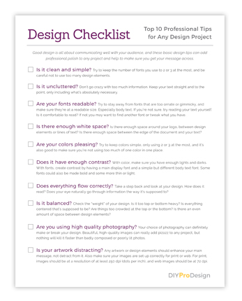
Would you like a Free Checklist?
Subscribe to my free Resource Library to get access to all my freebie downloads like pdf worksheets and checklists, plus InDesign template downloads.