The Non Designer’s Guide To Choosing Basic Fonts

The Non-Designer’s Guide To Choosing Basic Fonts

Note: This post contains affiliate links, which are noted with an asterisk (*).

This is part 2 of my series “How to Create a Design Style.” You can find the other posts in the series at these links:

Choosing your fonts can definitely be overwhelming — with so many styles to choose from it’s hard to know where to begin. The thing to know though is that there are some things you can do that can help make finding good fonts a lot easier than you would think.

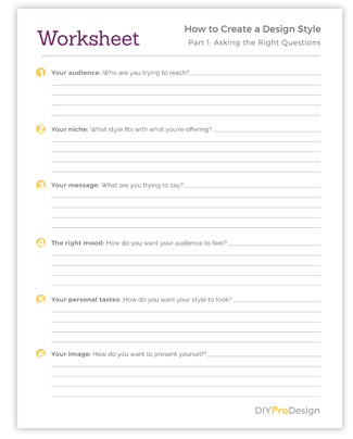
First, I would highly suggest answering the questions in this post about your business, in terms of the message you’re trying to send and the mood you’re trying to create. Thinking about the answers to these can really help narrow things down for you and help you find your fonts a lot faster.

Then, keep reading for some things to keep in mind while you’re looking. It basically just boils down to knowing the types of fonts you need, and some good places to find them.

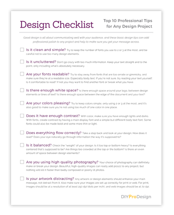
1. You’ll need to know a few font terms.

When you look for fonts, you’ll notice that there are of course many different kinds, but the thing to know is that they can be broken down into a handful of categories. And while there are many types, these are the basic ones. Just knowing these covers most of the bases.

Here are the basic types of fonts:  Serif, Sans Serif, Script and Slab Serif.

Serif Fonts – Serif fonts are generally for more traditional or elegant styles. They get this name from the tiny decorative flourishes on each of the letters called “serifs”. Serif fonts are great for headers, and when used properly can work well for body text. Here’s an example of a Serif font:

Serif fonts can give a classy look to headlines.

Sans Serif Fonts – Sans serif fonts create a more modern or contemporary look. They have a very clean feel since they don’t have the serifs, hence the “sans” in the name. These can be used for any type of text or content, and work great for either headers or body text. Here’s an example of a Sans Serif font:

Sans Serif fonts are easiest to read.

Script (or Handwritten) Fonts – Script fonts give an elegant, artsy look and should be used very sparingly. You also want to use these at a larger size so they’re not hard to read. They should only be used for headers and other short phrases. Here is an example:

Script fonts can be hard to read at smaller sizes.

Slab Serif Fonts – Slab serif fonts generally give a more laid back and informal look. Their serifs are more “block” like and squared off. These are best used in headers as a more decorative font. I would stay away from using slab serif fonts in body text since they can be hard to read in paragraph form at smaller sizes. Here is an example:

Slab Serif fonts can work great in headers.

When you are trying to decide which of these types to use for your style, you’ll definitely want to choose fonts that fit with the message you’re trying to send to your audience, and the mood you’re trying to create.

2. You mainly need 2 fonts for your design style.

To start out with, you really only need 2 fonts. You will need a Display font a for headlines and subheads, and a second font for Body Text. That’s really all you need to begin with. I’ve also listed some optional extra types that can dress things up a bit.

But you do really only need these 2 to start.

First – Display font for headings, titles and subheadings

Display Fonts – Display fonts are generally more bold and can be more decorative since they are used at larger sizes for headlines or other attention-grabbing copy.

This is an example of a Display font.

Your display font is definitely the most important. This is the one that is going to give the most personality to the look of your style, and I would put the most time into finding the right font.

I would suggest sticking with serif, sans serif or slab serif for this, since script fonts can be a little more tricky as far as readability.

When you’re just starting out, definitely keep this font simple. Simple does not have to mean boring — it can also mean clean and classy.

Google fonts has a ton of great free options. Here are some ideas:

Second – Body text font

Body Text Fonts – Body text fonts are generally more plain and simple, and work well at a smaller size since they’re easier to read and are used for paragraphs of text.

This is an example of a Body Text font.

It’s a good idea to choose a font with different styles like bold, semi bold, italic, bold italic, etc. That way when you emphasize something in your content, you automatically have a matching font to do it with.

Serif or sans serif fonts work great for this, but be careful with using serif fonts for body text because they can tend to be hard to read at the smaller size. Using a clean sans serif font is usually the safest option for readability.

Again, Google Fonts is a great place to find a ton of these, and these are some good options:

A Couple Tips on Font Combining and “Test Driving” Fonts:

Font Combining – Google Fonts has a neat feature where you can click on a font and it will show you some great fonts that will go with it. Just go to the “Pairings” tab under each font.

Font “Test Driving” – Most sites will have a place where you can type in some text to “test drive” the font. Try this with several words to make sure it’s going to look like you think. The preview images for these only show these fonts in their best light, and I’ve found that sometimes a font I thought I would like doesn’t work as well when I try out different words.

Other optional types of fonts:

These last 2 are definitely optional, but when used right they can do a lot dress up your look:

Decorative Fonts – These types of fonts are only used sparingly, but when done right they can really add some interest to your style. Script or handwritten fonts also work well for this.

I’ve found that the best fonts for this are usually paid versions, and you can find some great ones at Creative Market*. (Note: People also refer to these as “display” fonts, so the term can be used interchangeably. A display font is essentially any font that can be used as a header, and this can include many types of fonts from the most simple and plain to the most ornate.)

Again think readability here, especially with these. On the really decorative ones, I only ever use the font in a large header, on 1 to 3 words at a time. Never a whole phrase and never a whole sentence.

I also make sure to use these at a fairly decent size. You really do not want to use fonts like this at a small size and risk your text being hard to read.

Think of these fonts as “the cherry on top.” Again, you use them very sparingly, so as to not let them overpower your layout. It doesn’t take much for them to have a good effect.

Pull Quote Text – Also sometimes referred to as “call out text.” This is text that is used to call attention to a certain quote either from your body text or to reference a quote from someone else.

This is an example style for a pull quote, also referred to as 'call out text'."

It’s usually larger in size than the rest, and is sometimes a different color. Many times an italic version of a font is used. I suggest using an italic version of your body text for this so it will blend well with your body text font.

3. Where to find fonts.

While there are definitely many places to find fonts, here are some of my favorites:

Creative Market* – One of the best places to find beautiful script or handwritten fonts, display fonts, logo fonts, plus tons of other great artwork.

Google Fonts – Great commercial use fonts you can use for free, plus I love their feature that makes it easy to find those elusive font combinations.

Font Squirrel – This is a great place to find free commercial use fonts.

Dafont.com – Each font should list the type of use it’s okay for. Make sure it does not say “personal use.”

Quick Tip: I don’t download fonts from just anywhere, because some font sites can be spammy. Plus their fonts may only be licensed for personal use. I try to stick with a few very reputable font sites to avoid accidentally downloading a virus, plus if you’re using them for your monetized blog, you’ll definitely want to only use fonts that are licensed for commercial use.

Wrapping Up

Finding fonts for your style does not have to be as difficult as it sounds.

Again, you only need a couple types of fonts for your style, and it’s definitely best to keep it simple, especially when you’re just starting out. You don’t want it to be too boring, but clean and classic is always a safe bet. Use your instincts, and you don’t have to be a pro to get this right. Just use what looks good to you. Besides, you can always change it later if you need to.

Ask yourself, do these fonts fit with the style and image I’m trying to present? Do they make my business look professional? Are they clean and easy to read? If you can answer yes to those questions, you’re well on your way to a great style.

Any questions about fonts? I’d love to hear them in the comments!

Get my FREE InDesign Mini Course

Get access to my 5-lesson video course to learn how to create blog graphics, checklists, worksheets, promo graphics and more.

The Non-Designer’s Guide to Choosing Colors

The Non-Designer's Guide to Choosing Basic Colors

This is part 3 of my series “How to Create a Design Style.” You can find the other posts in the series at these links:

After choosing your fonts, your colors are the next most important element to your design style.

And while there is a dizzying assortment of color options and palettes out there, this can actually be a fairly simple process.

The key is to know what colors to look for, how to understand color palettes, and then how to use the colors once you find the palette that works for you.

And the other key principle here is to keep it simple. Less is more definitely applies here — you don’t want to go overboard with your color.

When color is done right and used in a simple fashion, it can really make your graphics pop and give your business a classy, professional image.

Here are some things to keep in mind when choosing and using your colors:

1. Get clear on the mood you want to convey for your style.

Colors evoke feeling. Some colors give a sense of calm, while others give a sense of energy and action.

The colors you choose are going to create a certain mood and give your audience a certain feeling, so you definitely want to think through what that needs to look like for your style.

If you need help with this, I have some questions that you can answer here in this post that can get you started.

Brighter tones are more energizing and really pop. Muted tones tend to look more traditional and, depending on the shade, can give a more calming effect.

Here are some examples from Design Seeds:

Photo credit: @troy.archer

Photo credit: @theflowerjam

Photo credit: @elizabethmarkham

Photo credit: @622flowers

2. Learn how to "read" color palettes.

Color palettes can definitely be a bit confusing. But the trick is to know how to apply and use each color in the palette.

A great place for color inspiration, Design Seeds, usually has 5 or 6 colors to their palettes.

I’ll talk about this more below, but the key is to first decide on a main color that you want to go with. This will need to be a color that contrasts well with white, and then do a search for that color.

When you find palettes using your main color that fit the mood you’re trying to create, there should of course then be a swatch that represents your main color, and then other contrasting, or “accent”, colors around it.

Just choose the best 1 or 2 accent colors that are not too light, that contrast with or compliment your main color well, and will be visible enough on things like headers and backgrounds.

Then the other colors in the palette are usually on the lighter side, or are other variants on the main color or accents. Don’t feel like you have to use all of them, and in fact, you will want
to use any color other than your main color very sparingly. It can be easy to overdo it if you’re not careful.

These can work well for design elements like lines, boxes and backgrounds. The lighter shades can work well with darker text on top, and the darker shades work for using white text on top.

And the extra light shades can work really well for a light colored background option on a sales page or brochure.

3. Choose your main color first.

When you’re looking for colors for your style, you’re going to need to choose the one main color that you are going to use most prominently first. Then you can use that color to choose the others that will blend well with it, again, based on the mood and feeling you’re trying to create.

When you’re choosing your main color, definitely make sure it contrasts well with white. Don’t choose a color that is too light, or it will make any text that it’s used on unreadable.

You want to make sure the color is dark enough so that your headlines will be easy to read when the color is applied to them.

Stay away from lighter yellows, greens or other more pale shades as your main color.

4. Choose your accent color(s).

Accent colors are great to have and give more dimension to your designs. To choose accent colors, use your main color as a starting point and then choose colors that work well with that.

You will want to choose 1 or 2 accents at the most, and these colors will definitely affect the mood that your designs convey.

You can go 2 different ways with your accent colors. You can either choose a bright “complimentary” color — essentially the polar opposite of your main color, which generally creates a more vibrant look. Or you can choose colors that are closer in value to your main color, which gives a look that is more subdued.

For example:

Let’s assume you choose a dark blue for your main color. You could go the more vibrant route and choose oranges, golds or yellows for your accent, or you could go for a more calming look and use greens or purples. Or to make it really simple, you can just use different shades of the same blue.

Here are some examples of this from Design Seeds

Photo credit: @andrea_sopranzi

Photo credit: @chrismoon1969


Photo credit: @greenineverycolor


Photo credit: @emilycontephotography


Photo credit: @thebungalow22


Photo credit: @marjamatkalla

5. Use your color sparingly.

As I’ve mentioned, you definitely want to try to not go overboard using your color.

Just sprinkle it through enough and it will make your designs pop in a classy way.

You will want to use your main color most of the time on your headlines and subheads, and then let the bulk of your text and your content be a black or gray color. You can also use shades of gray to add interest to certain types of elements as well.

When you do use your accent color(s), us them very sparingly for things like buttons or links, and use the extra colors in the color palettes when needed on other design elements like lines, boxes and backgrounds.

6. Look for color inspiration.

While there are definitely many tools out there for finding color ideas, my personal favorite place for color palette inspiration is Design Seeds, as you can tell from this post.

I love the way they choose color palettes from life.

They take photos of real life places, objects and scenery, and draw color palettes from the colors in the photo. To me this is really helpful for finding colors that are harmonious, soothing and that make sense together and work together well. It always makes for very natural combinations.

In Conclusion

While choosing your colors will take a little time, they can actually be fairly simple to find with a little know-how. Just choose the main color that represents the mood you’re trying to create, then use that as a springboard to find palettes with accents to really flesh it out.

And again, always remember with using your color — less is definitely more.

Any questions about choosing colors? I’d love to hear them in the comments!

Get my FREE InDesign Mini Course

Get access to my 5-lesson video course to learn how to create blog graphics, checklists, worksheets, promo graphics and more.

How to Make a Simple Text-Only Logo with InDesign

How to Make a Simple Text-Only Logo with InDesign (Plus Font Tips)

Play Video

This is part 4 of my series “How to Create a Design Style.” You can find the other posts in the series at these links:

Making your own logo does not have to be an intimidating prospect. In fact, an easy and inexpensive way for non-designers to create their own is to make a simple text-only logo.

Text-only logos are great because they’re easy to create, they look professional, and they make it really easy to follow the rules of good logo design. Plus If you think about it, some of the biggest and most well known brands use a text-only logo. Think Sony, FedEx, The New York Times, Google, and many more. Same thing with some popular bloggers like Amy Porterfield and Melyssa Griffin.

In this video, I’ll show you how I made my text-only logo in InDesign, plus how to export your logo from InDesign into different file formats that you can use for different things like web pages, social media graphics, presentations or print projects. And I’ve got some tips for choosing a good logo font, some suggestions for free fonts, plus more to help you get started:

Tips for choosing a good logo font:

Free logo font suggestions:

Tips for using color in your logo:

File types and terms mentioned in the video:

In the video I showed how you can export your logo from InDesign into these file types, and also discussed “vector graphics.” These are some file types that can get you started if all you have is InDesign, and I’ve included the terms here again for reference:

PDF – These can be placed in printable downloads, blog graphics, web pages or presentations, and can also be used in projects that will be professionally printed. In the video, the PDF logo graphic I made was a “vector” graphic because my text artwork in the file I used to make the PDF was vector-based (see below for an explanation of vector graphics).

JPEG – These files can be used on websites, social media graphics, slide presentations, e-books, or anything that will be viewed online. They are resolution-based so they can only be enlarged to a certain size before they start to become pixelated. It’s also best not to use a JPEG version of your logo for anything that will be printed because JPEG logos tend to print “fuzzy.”

PNG – These files have a transparent background and can be placed on web pages, social media graphics, slide presentations, e-books, or other screen-based projects. These are great for if the design has some color in the background, where you need your logo to not have a white box around it like with a JPEG. These are also resolution-based, and can only be enlarged so much. It’s best not to use these logo files on printed projects as well.

Vector Graphic – These are graphics that have clean and crisp lines, and can be enlarged to any size without losing quality. You will want to use a vector graphic of your logo for print projects like business cards or brochures, because these types of logos look clean on the final printed piece. If you’re using InDesign for your social media graphics or web graphics, you can go ahead and use vector versions of your logo on these as well because it will be converted to the right format along with the entire graphic when you export.

In Conclusion

Creating a professional logo does not have to be hard or complicated. A text-only logo is definitely a great way to get started, and later on you can always add to it or make another one if you decide you’d like something that’s a little more creative. There are lots of great resources out there when you’re ready.

Any questions about text-only logos? I’d love to hear them in the comments!

Get my FREE InDesign Mini Course

Get access to my 5-lesson video course to learn how to create blog graphics, checklists, worksheets, promo graphics and more.

How to Create a Design Style – Part 1

5 questions to ask before choosing fonts and colors

How to Create a Design Style – Part 1

5 Questions to Ask Before Choosing Fonts & Colors

This is part 1 of my series “How to Create a Design Style.” You can find the other posts in the series at these links:

design style – sometimes called a style guide, brand board or brand style guide.

We all know we need one. That consistent look to our brand that gives us credibility with our readers and increases our social shares. The style that will be carried through everything we design for our business – our website, blog post graphics, content upgrades, on and offline promotions – everything.

But how do you go about creating one? While it is a fairly simple process, it can take some time and definitely takes some research and thought. Especially if you tend to be a perfectionist like I am.

The way to find a design style is basically to answer a few questions about your audience, message and niche, and then use the answers to these questions to choose the fonts and colors that will best fit the look you’re trying to create.

In this post, I’ll be talking about laying the foundation by asking the right questions.

Part 1: Laying the Foundation

As I mentioned, the first thing to do when you’re creating a design style is to answer a few questions in relation to your audience, your niche, your message, and the overall image you’d like to convey.

It will be the answers to these questions that will guide you to finding a style that you’ll love and that will also communicate your message well with your readers:

1. Think about your audience – Who are you trying to reach?

The first thing you have to do is think about the people you’re going to be talking to. Who are they? Are they male or female? What are their ages? What do they like? How do they think? Think about what type of style would appeal to them and also, what style they’d be most likely to respond to.

Would they respond to bright, bold colors with contemporary fonts? Or maybe they’d respond better to more muted colors and traditional fonts.

This is a very important first step because you want your style to “speak” to the people you’re trying to reach and create a favorable impression with them, and to do that you definitely need to know who it is you’re talking to.

2. Think about your niche – What style fits with what you’re offering?

What style would normally go with your topic, product or service offering?

For example, a blog about mountain climbing might have more of a rugged, outdoors style while a site for a yoga studio might have a look that’s more simple, zen and serene.

3. Think about your message – What are you trying to say?

What message do you want to get across to your audience, and what style would best convey that message?

Again, you want your style to “speak” to the people you’re trying to reach and create a favorable impression with them.

For example, a subdued style would go better on a site for a non-profit women’s shelter with a somber message, while people coming to a blog about decorating and home decor would respond better to a style with a much brighter feel.

Which leads me to the next question . . .

4. Think about the mood you want to create – How do you want your audience to feel?

Design is all about communication, and creating the right mood can go a long way in helping to get people “on board” with what you’re trying to say to them. It helps them get involved with your message and will hopefully move them to take whatever action you are wanting them to take.

Take the home decor blog again – or better yet, a home decor retail site. The feel of the site will probably be very bright and airy, with gorgeous pictures of beautifully decorated rooms. So what would that do for you as you look at a site like that? I know that for me, it would put me in the mood to look around and get decorating inspiration, and possibly see if there’s something I’d like to buy for my own house.

So what mood would best get your message across? What style would create the right “feel” for your message and help your audience respond in the way you want them to?

Do you want people to feel invigorated or excited? Or maybe laid back and relaxed?

It all depends on what you’re trying to say to your audience and what you’d eventually like for them to do.

5. Think about your image – How do you want to present yourself?

Lastly, what overall image do you want to present to your audience or how do you want your style to come across? We all know that we want to present a credible, professional image and that will of course be part of everything we do. But we need to get slightly more specific.

Do you want your overall look to appear high-class and sophisticated? Or more low-key and easy going?

The answers you give in the 4 previous questions will also play a part in this. The style that will best fit your audience, niche, message and the feel you want your style to have will be part of the overall image you create, and it’s a good idea as you go along to think about exactly what image you want that to be.

Next Steps: Choosing Fonts and Colors

As I’ve already mentioned, once you have the answers to these questions, you’ll be able to use them as a guide as you start looking for the fonts and colors that will make up your style.

In Part 2 of this post, I’ll be talking more about choosing fonts, and how you can use them to create different moods with your designs. 

Things to Remember

Creating a design style is definitely a process. It can take some time to really settle on something you like, and remember it’s okay to change your mind – you probably will several times. I know I have for projects I’ve worked on.

In the end, the best design style is going to be one that you really like, and will also cause your audience to get involved with what you’re trying to say. Your style will help bring your audience on board with your message, and will give you a consistent look that will create the credible and professional image that you’re looking for.

Is there something you’ve always wondered about design but didn’t know who or how to ask? Post your questions in the comments below and I’d be happy to help!

Would you like a free worksheet?

Subscribe to my free Resource Library to get access to all my freebie downloads like pdf worksheets and checklists, plus InDesign template downloads.

About the Author

Hi! I’m Melodie, and I help bloggers and solopreneurs create their own graphics for their businesses. I’ve been a graphic designer for over 20 years, and I can tell you that just by learning some basics, you can definitely create a professional look for your brand, even if you don’t see yourself as a designer.

Top 10 Pro Design Tips for Any Project

top 10 pro design tips for any project

Top 10 Pro Design Tips for Any Project

Top 10 Pro Design Tips for Any Project

Good design is all about communicating well with your audience, and these tips can add professional polish to to any project and help to make sure you get your message across.

1. Keep it Simple.

With design, less really is more. Keeping it clean and simple will help make sure your design does not detract from your overall message.

Try to keep the number of fonts you use to 3 or 4 at the most, and be careful not to use too many design elements.

2. Keep it Uncluttered.

Don’t go crazy with too much information. Keep your text straight and to the point, only including what’s absolutely necessary.

Keeping your design clean and uncluttered will make your message clear and keep from confusing or overwhelming your audience.

3. Keep your fonts readable.

Your fonts can either make or break your design. If your design isn’t readable, your message will not get across.

Try to stay away from fonts that are too ornate or gimmicky, and make sure they’re at a readable size. Especially body text.

If you’re not sure, try reading your text yourself. Is it comfortable to read? If not you may want to find another font or tweak what you have.

4. Is there enough white space?

One way to help keep things readable, clean and uncluttered is by making sure you’ve got enough “white space” in your design, or distance between elements.

Is there enough space around your logo? What about between design elements or lines of text? Is there enough space between the edge of the document and your text?

Making sure you have enough space between elements will make your design comfortable to look at and won’t take away from your overall message.

5. Are your colors pleasing?

Try to keep colors simple, only using 3 or 4 at the most, and it’s also good to make sure you’re not using too much of one color in one place.

Take a step back and ask yourself, is this too bright or too bland? Or, is my color making a certain part jump out too much?

If so, maybe try to “distribute” your color a little differently, and tone down the shade you’re using if it’s too bright.

If it’s too bland, try adding small amounts of an accent color. One way to find a good accent is to use colors that are opposite from each other on the color wheel. Click here for a link to a good online tool.

6. Make sure it has contrast.

To keep your design from looking flat and boring, try to create contrast with your colors and also with your font styles. With color, you can create contrast by making sure you have a good range of lights and darks.

You can create contrast with fonts by having a main display font and a simple but different body text font. Some fonts could also be made bold and some more thin or light.

7. Does the information flow correctly?

Make sure that the message of the design reads correctly. You can make certain parts stand out with larger font sizes and brighter colors, and you can make less important things smaller with the colors more muted.

Your design should lead the reader’s eye through the information in a certain way to make sure the most important parts stand out the way they’re supposed to.

Take a step back and look at your design. How does it read? Does your eye naturally go through information the way it’s supposed to?

8. Check the alignment of your design.

Is everything aligned that could be? It definitely makes a design look much cleaner if text and graphics are lined up with each other in some fashion.

For example, could the left side of your body text be lined up with the left side of your header? Or if there is a section where design elements and text are grouped together, could those be lined up in a certain way? Is everything centered that should be?

Every design is different, so definitely use your judgment with this. Sometimes using a grid can help as well.

9. Use quality photography.

Your choice of photography can definitely make or break your design. Beautiful, high-quality images can really add pizzaz to any project, but nothing will kill it faster than badly composed or poorly lit photos.

There are many sites online that have affordable or even free options for high quality photography. See a list here on my resources page.

10. Check your artwork.

Does it stand out too much? Any artwork or design elements you have should serve to enhance your main message, not detract from it.

You also want to make sure your images are set up correctly for print or web. For print, images should be at a resolution of at least 250 dpi (dots per inch), and web images should be at 72 dpi.

Would you like a Free Checklist?

Subscribe to my free Resource Library to get access to all my freebie downloads like pdf worksheets and checklists, plus InDesign template downloads.